Overview
JobDiva is the global leader in Talent Acquisition, Talent Management, and Applicant Tracking technology delivered as a SaaS solution to the staffing and recruiting industry.
The old candidate portal was built 7 years ago, with a rigid information architecture that can no longer support our clients’ needs. We walked into this project to redesign the portal to increase efficiency and clarity.
Client:
JobDiva
Team:
1 Designer (Me!) + 1 Product Manager + 4 Developers + 4QAs
My Role:
Design System, UX Design, UX Research, Interaction Design, Information Architecture, Wireframe, Visual Design
Duration:
01/2018 - 09/2018
Background
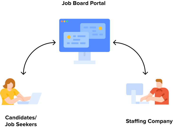
Job board portal is one of JobDiva’s product which allows staffing companies to embed it into their website to display job openings. This portal pushes staffing companies’ open jobs out to the world, giving effectively free advertising, while simultaneously drawing fresh candidates into clients’ database.
It also empowers candidates to upload resume to apply to jobs as well as manage their own application process and documents.
Challenge
Identifying problems of the current design
The redesign of the job board portal is about applying a new design system and empowering the product with better user experience. We hope the new design could simplify the job application experience and improve the profile building process.
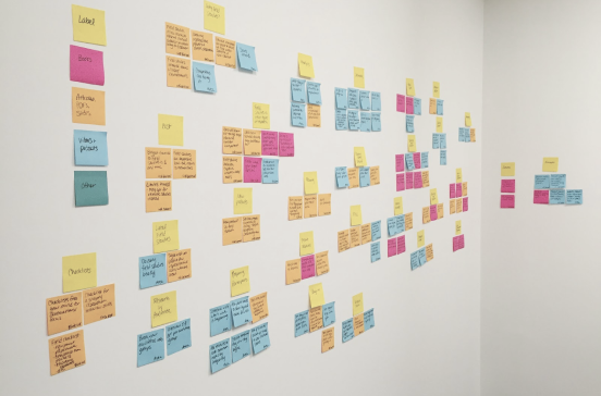
Before jumping directly into fix mode, I conducted a usability test with 5 participants. The entire test utilized several testing methods that included observation, think-aloud protocol, and semi-structured interviews; this allowed us to collect more contextual data to assess the usability issues further. The list of the problems identified was humongous. Hence I, with the help of Product Leadership, prioritized them based on urgency, user needs, business value, feasibility, and alignment to strategy.

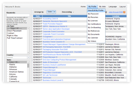
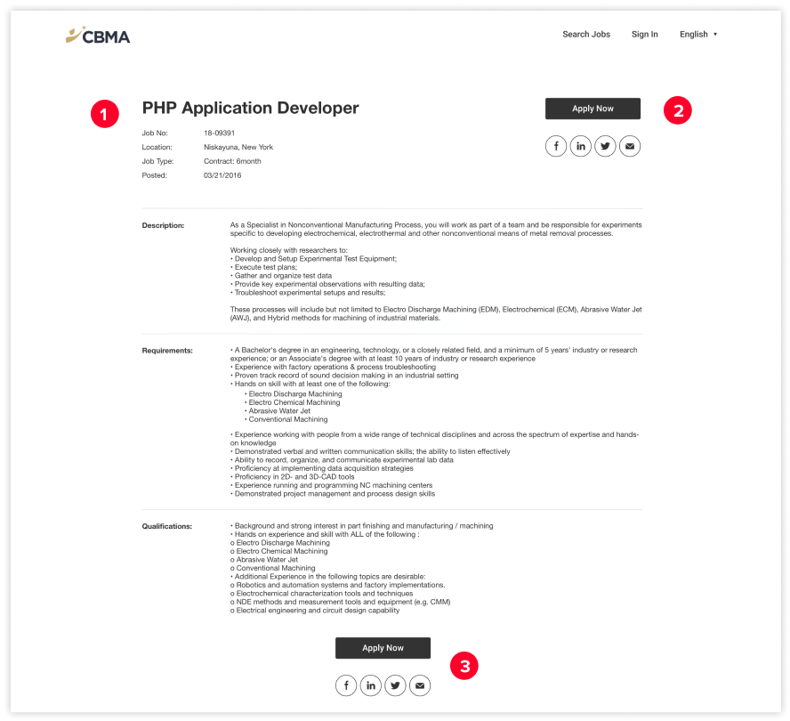
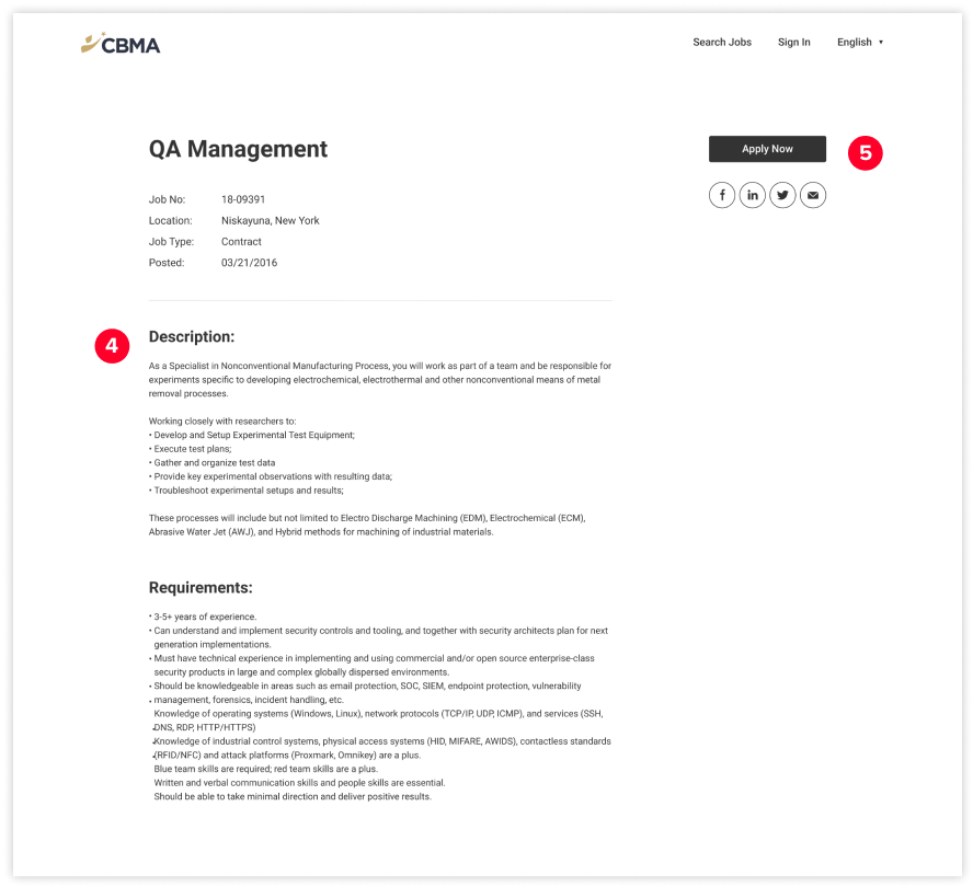
Old Design of Job Board Home Page
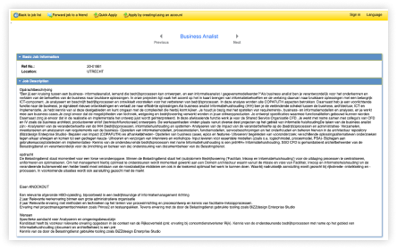
Old Design of Job Detail Page
Old Design of Resume Sharing Page
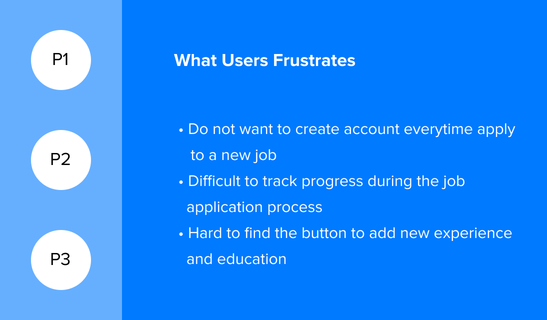
PROBLEM 1:
Highly misunderstood user groups and archetypes
Most users (job seekers) come to staffing companies’ websites from third-party online job boards (Indeed, Linkedin, Monster, etc.), where staffing companies promote their opening jobs. The 1st touchpoint of visitors on the site is the individual job detail page instead of the job search page. Instead of searching for jobs, most job seekers come to staffing companies websites to create a profile in the site, upload or create their resumes to apply to a specific job.
PROBLEM 2:
Lengthy registration and process make job seekers drop out during the job application process
Difficult and tedious registration and job application processes added cognitive load to users and did not support reassurance for them. JobDiva wants to provide a new design to simplify the registration and profile building process.
PROBLEM 3:
Poor organization of information hierarchy and ambiguous terms confuses existing users
Different typefaces, weights, and inconsistent use of color failed to deliver a sufficient visual hierarchy and made it difficult for users to find information on the website. The layout of the list and form are not organized, which makes users have a hard time completing their tasks.
PROBLEM 4:
The current design is not fully integrated with the candidate management system.
Job Board Portal was initially created in 2010. JobDiva did not update its design while adding new features and functions on its candidate management system. The redesign should add the missing pieces and apply the new design system to the portal.
Business Requirements
Since our clients (staffing agencies) are not the direct user of the job board portal. In order to understand the business objective of using this product, we then talked to a few team leaders at staffing agencies. By talking to them, we collected 4 main objectives of using the candidate portal:
- Get resumes from candidates to expand resume data pool
- Collect a detailed profile of candidates in order to match a candidate with particular jobs
- Provide updates of job application status for candidates
- Allow candidates to share particular documents with recruiters using the portal at a later stage of the interview
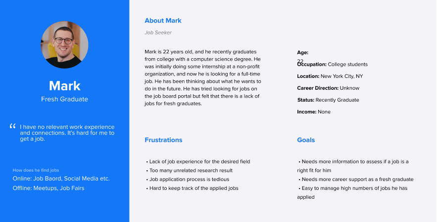
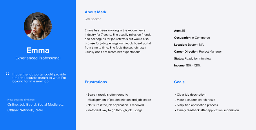
Refine Personas
My first step was to re-define these personas. I went through our user data and examined the engagement, transaction recurrence, and life-time-value of various user groups. I also performed a lot of market trend research and analysis, with the help of Product Marketing Managers, to come up with our two prime user segments.
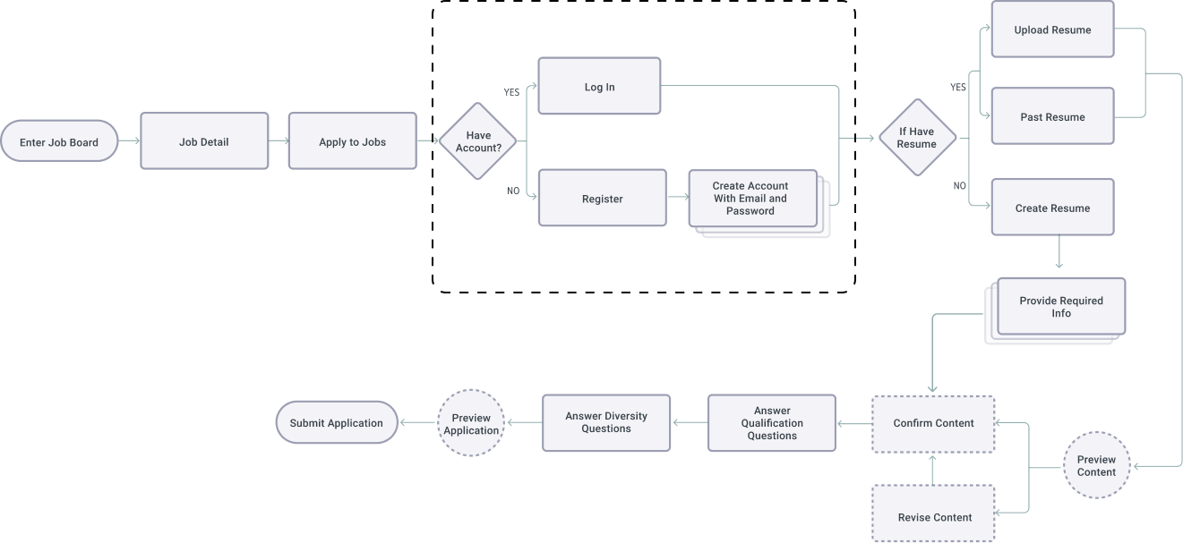
Redefine User Flow
Together with other feedback, I revised the current user flow of job application and resume building and iterated the flow of tracking the jobs that candidates applied. In the end, I created a flow chart to present the revised flows to the client and internal team.
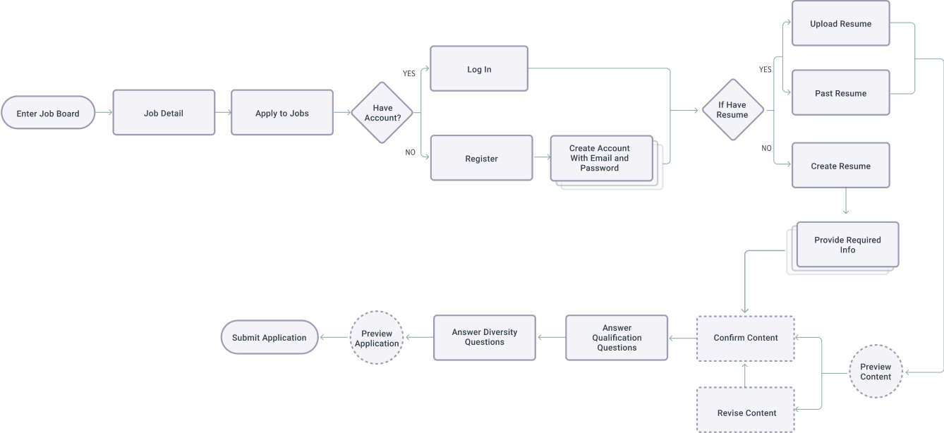
Here is the revised user flow for applying for jobs
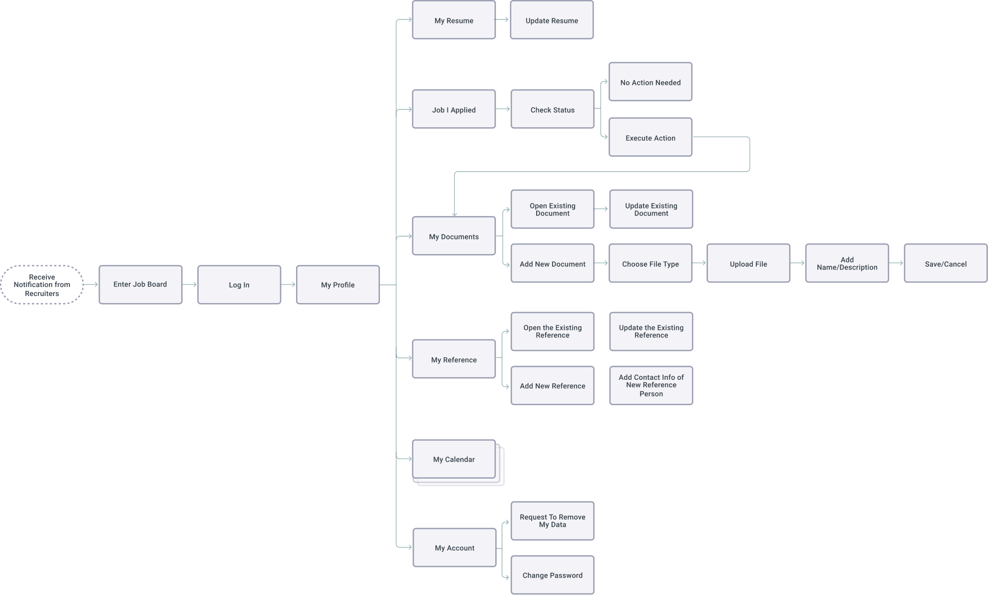
Here is the revised user flow for candidates renturn to candidate portal to submit more information
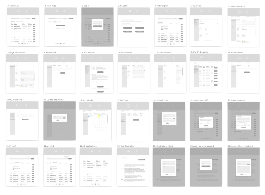
Create New Wireframe
Based on the research and brainstorming, I created the initial version of the wireframe that adapted the suggested solutions. At first, I built lo-fi wireframe to visually represent a high-level overview of the new ideas and gave me a quick understanding of user flows and how our users can navigate between different interfaces.
Validating the Solution
I conducted a quick round of usability tests to validate the solutions that I came up with for the redesign. For this usability test, I tested 3 major user flows that I wanted to focus primarily on:
- Flow 1: Job Application
- Flow 2: Resume Sharing
- Flow 3: Manage and update document
UX Challenge 1
Balance user feedbacks and business requirements
We received multiple negative feedbacks about the requirements of creating an account before applying to particular jobs. Several candidates consider the step of creating an account is unnecessary and complicated. Users do not want to spend extra time to share commonly used passwords on a one time use application. Instead, they prefer to drop off and leave the site.
However, because of the business requirements, we have to keep this function. We hope the job board portal could bridge communication between staffing companies and candidates, where candidates can share documents and manage onboarding necessities wat the later interview stage.
In order to motivate more job seekers to move forward to finish the application as well as creating an account, I decided to move the create account step after candidates provide all vital information and submit the application.
Here is the previous job application user flow
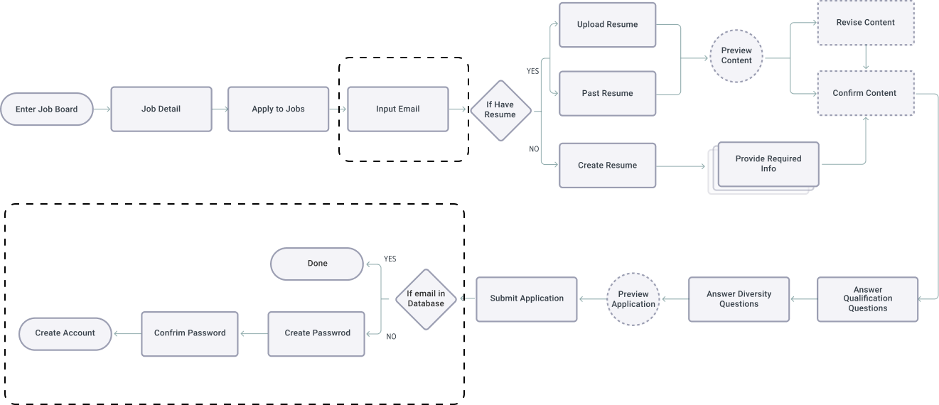
Here is the revised job application user flow
UX Challenge 2
Increase user engagements
From the usability test, I saw patterns of less engagement and drop-offs while candidates fill out job applications. The reason is that the current design requires too many extra questions on the application lists. For example, candidates are required to provide references information while filling out applications, however, a recruiter only needs a reference when that candidate moves to the later interview stage.
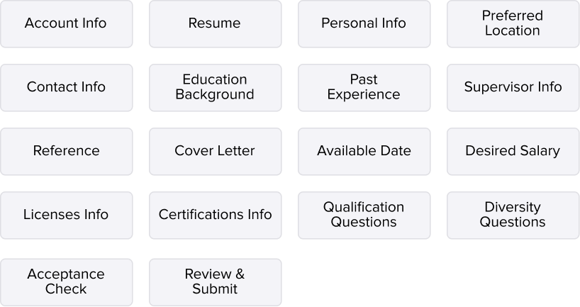
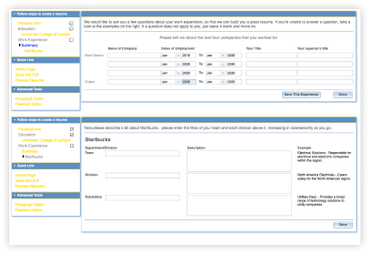
Here are infomation that candidates are required to answer on the current design
To provide reassurance for candidates to motivate them to submit the application, I decided to rearrange the info architecture:
1. I only keep the mandatory information on the initial application stage while moving elements like “reference”, “supervisor info”, and “legal documents” to the later stage.
2. In order to fully integrate with JobDiva’s candidate management system, I added a few more elements into the information architecture.
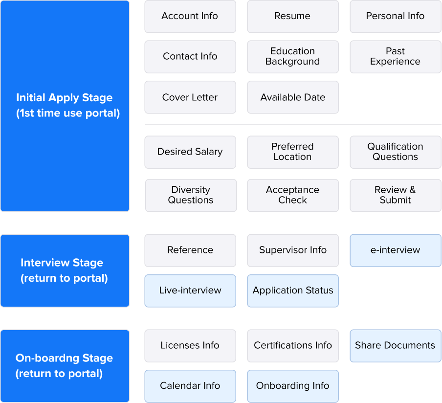
Here is the rearranged information archetecture
UX Challenge 3
Scale-up one product for different clients
Through the research, I found out that when candidates apply for different types of companies/jobs, they need to provide different levels of information. Hence, the length of an application form varies widely.
Most of the staffing companies do not list EEO questions or Voluntary Disclosure questions on the application form. Sometimes, candidates only need to answer 10 questions and upload their resumes while applying for staffing agency roles. On the other hand, companies like Toyota usually require candidates who apply for in-house roles to provide additional information related to a specific position. Some candidates may encounter more than 30 questions when applying for an in-house role.
Although having all questions listed on one single page has been tested as the most efficient way to fill out an application form, I decided to divide all questions into several sections to make them less overwhelming and less terrifying.
Here is the 1st iteration with all questions listed on a single page
Here is the 2nd iteration with all questions are devided into few catogories to make it less messry and less terriyfying.
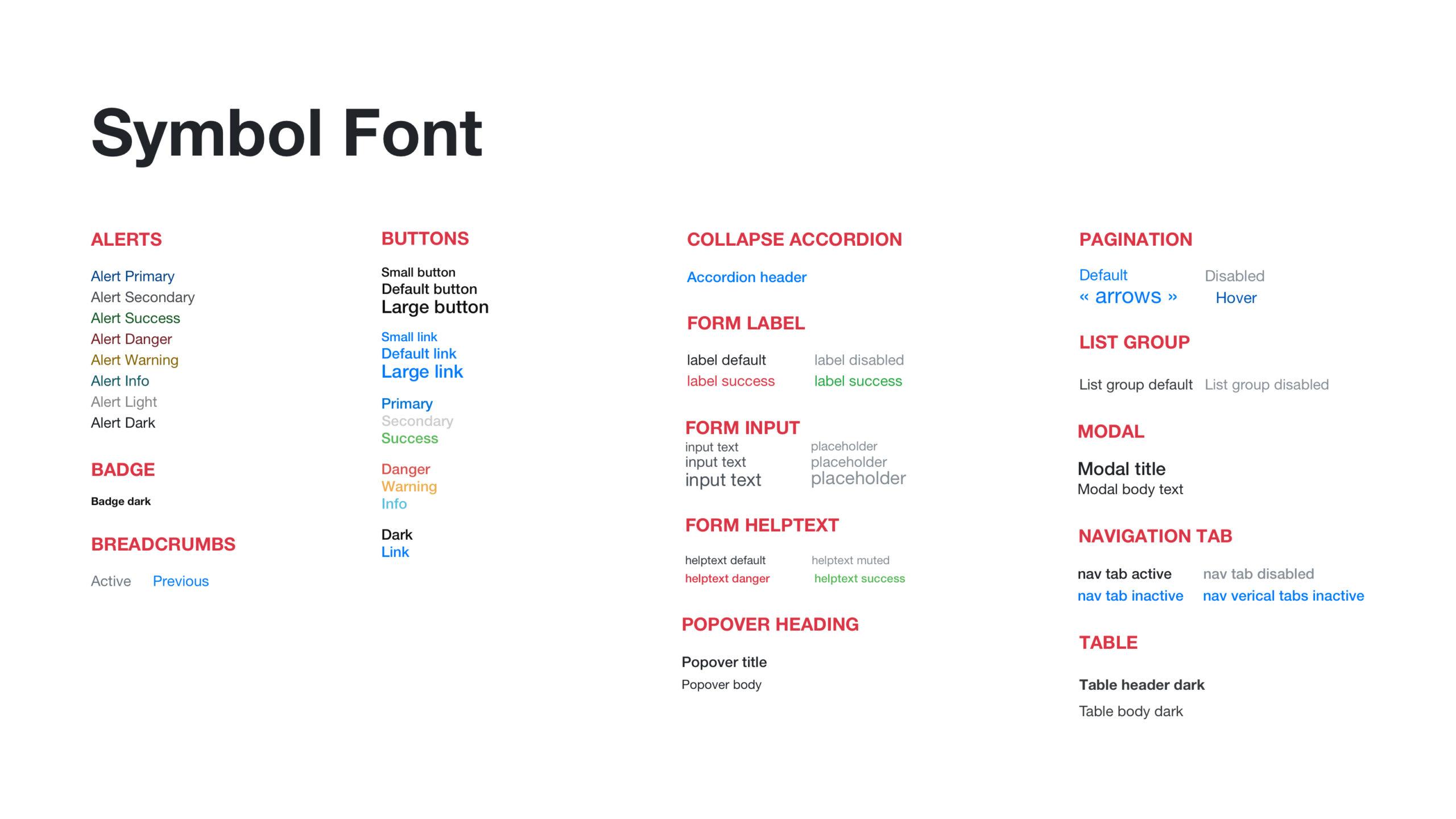
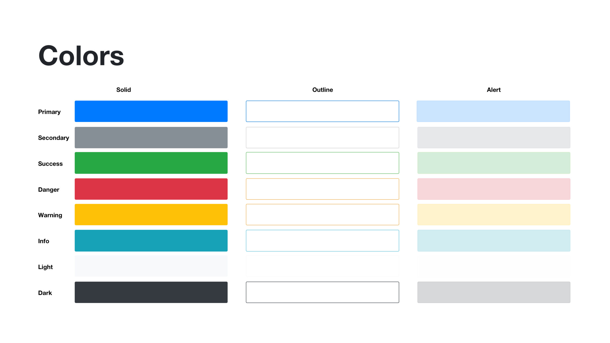
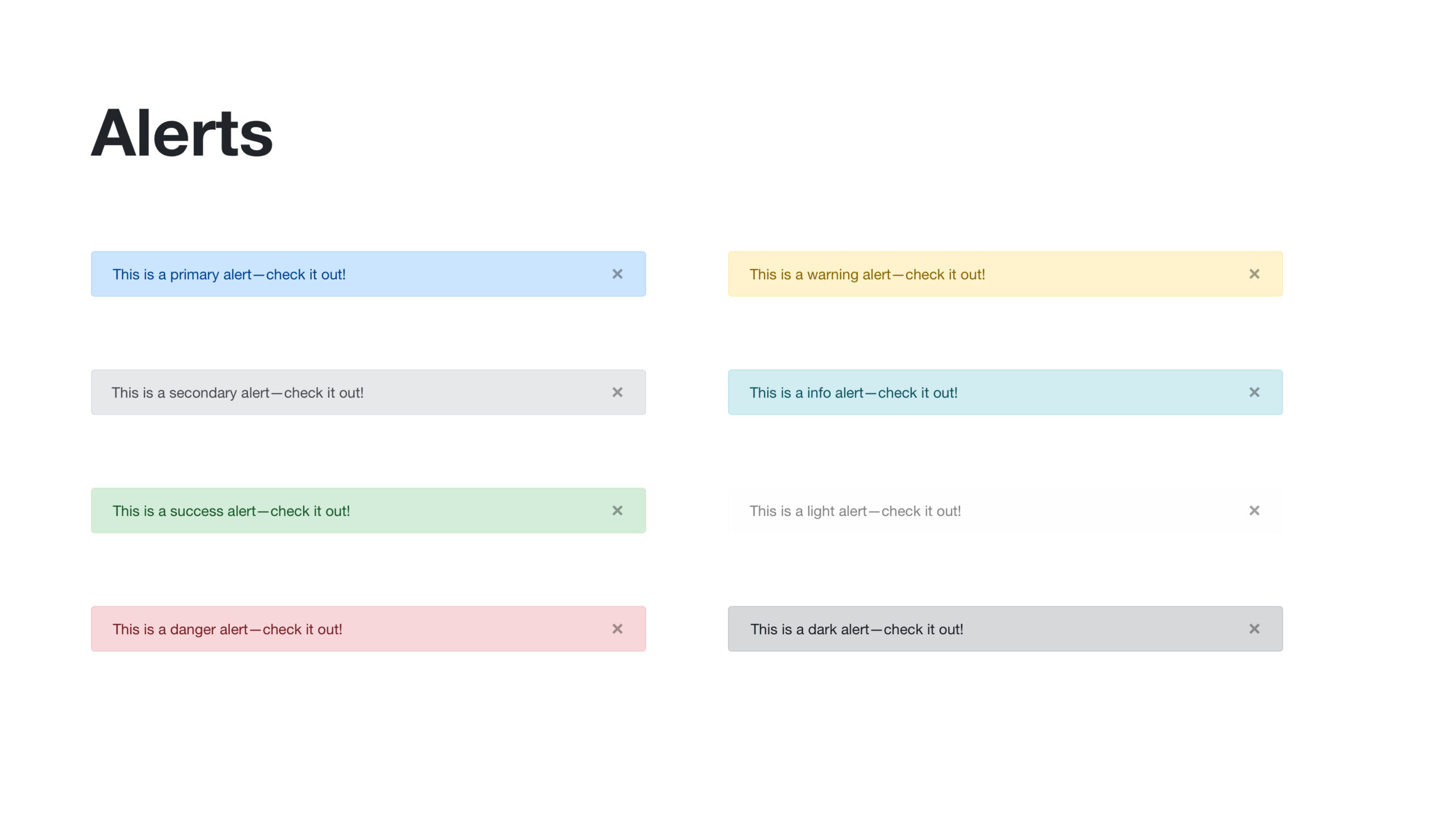
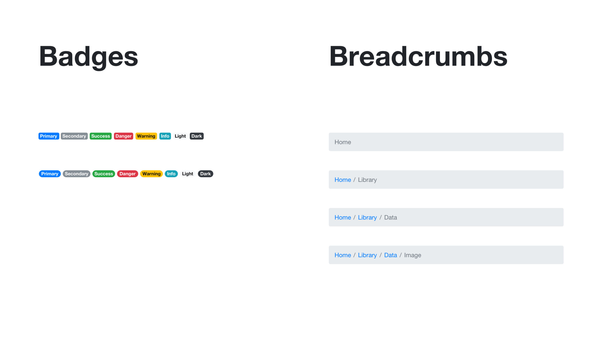
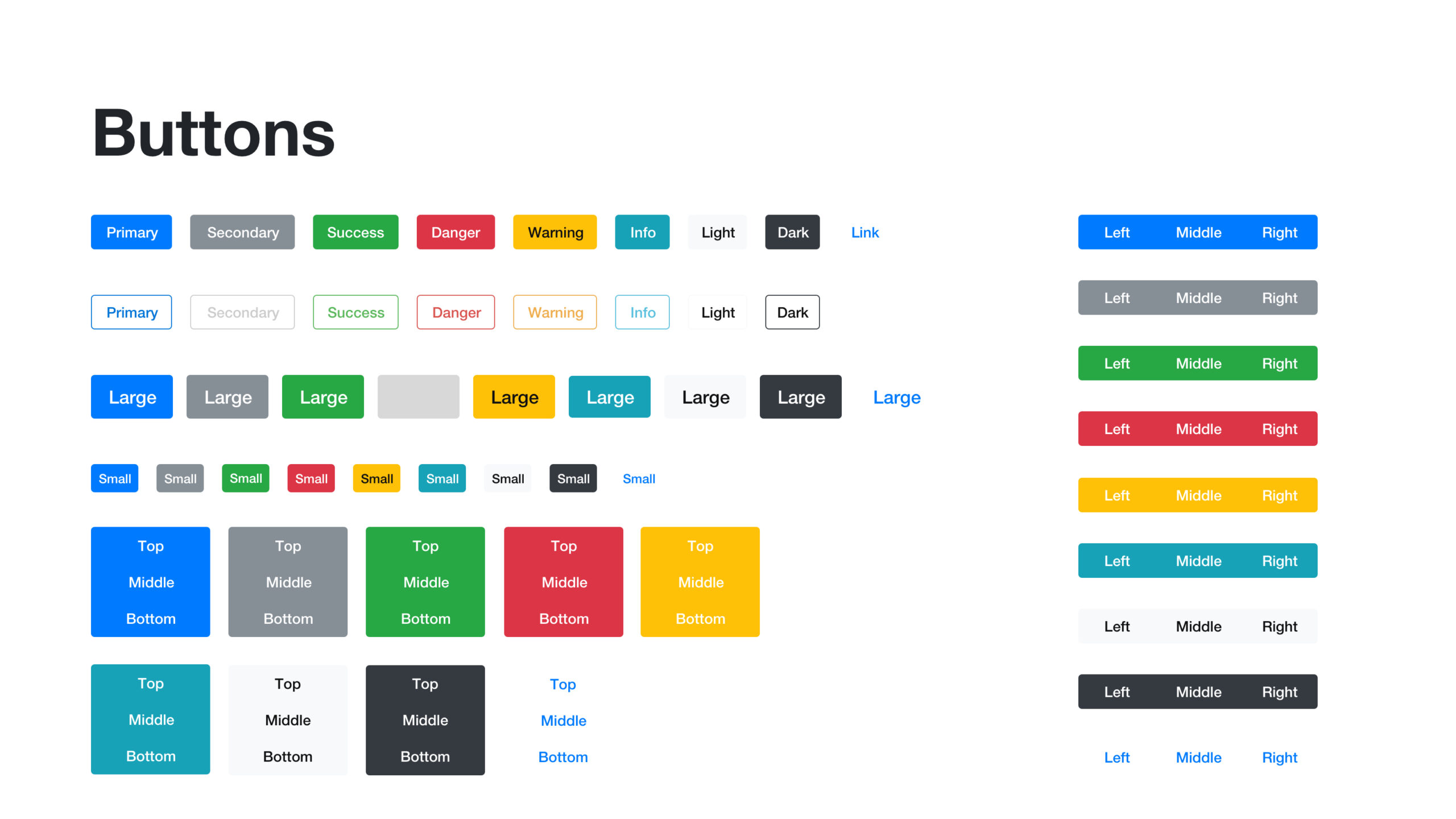
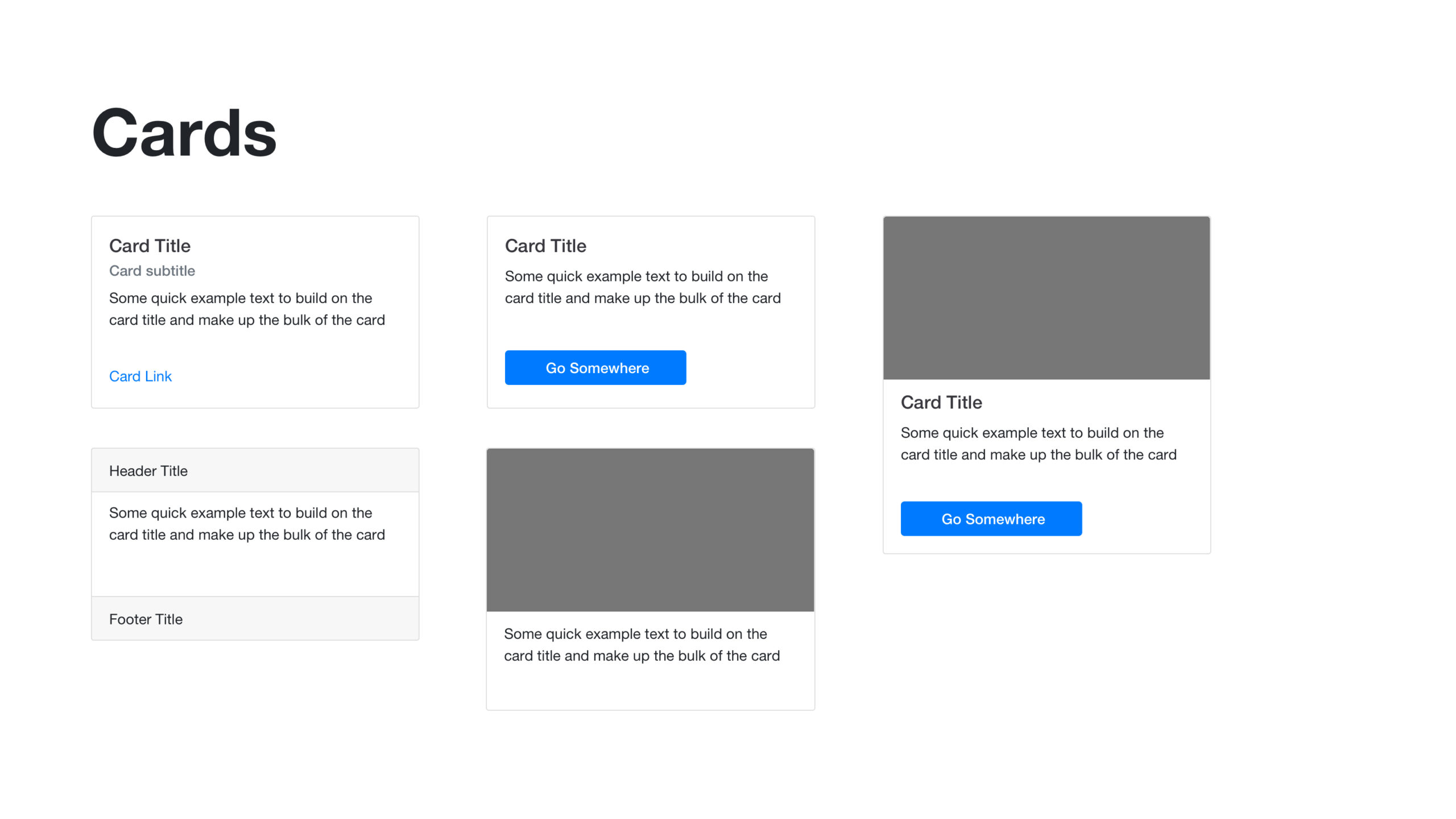
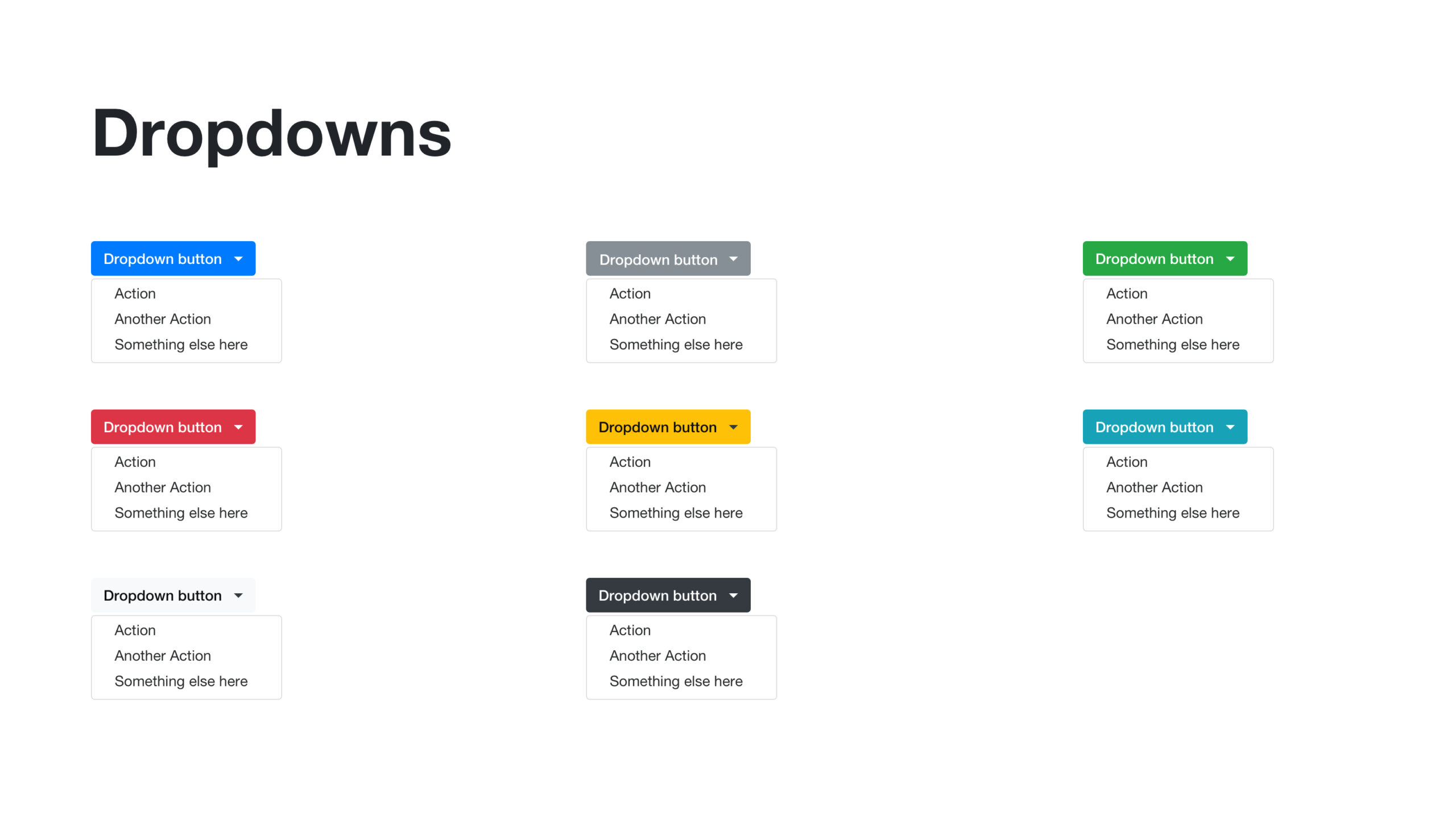
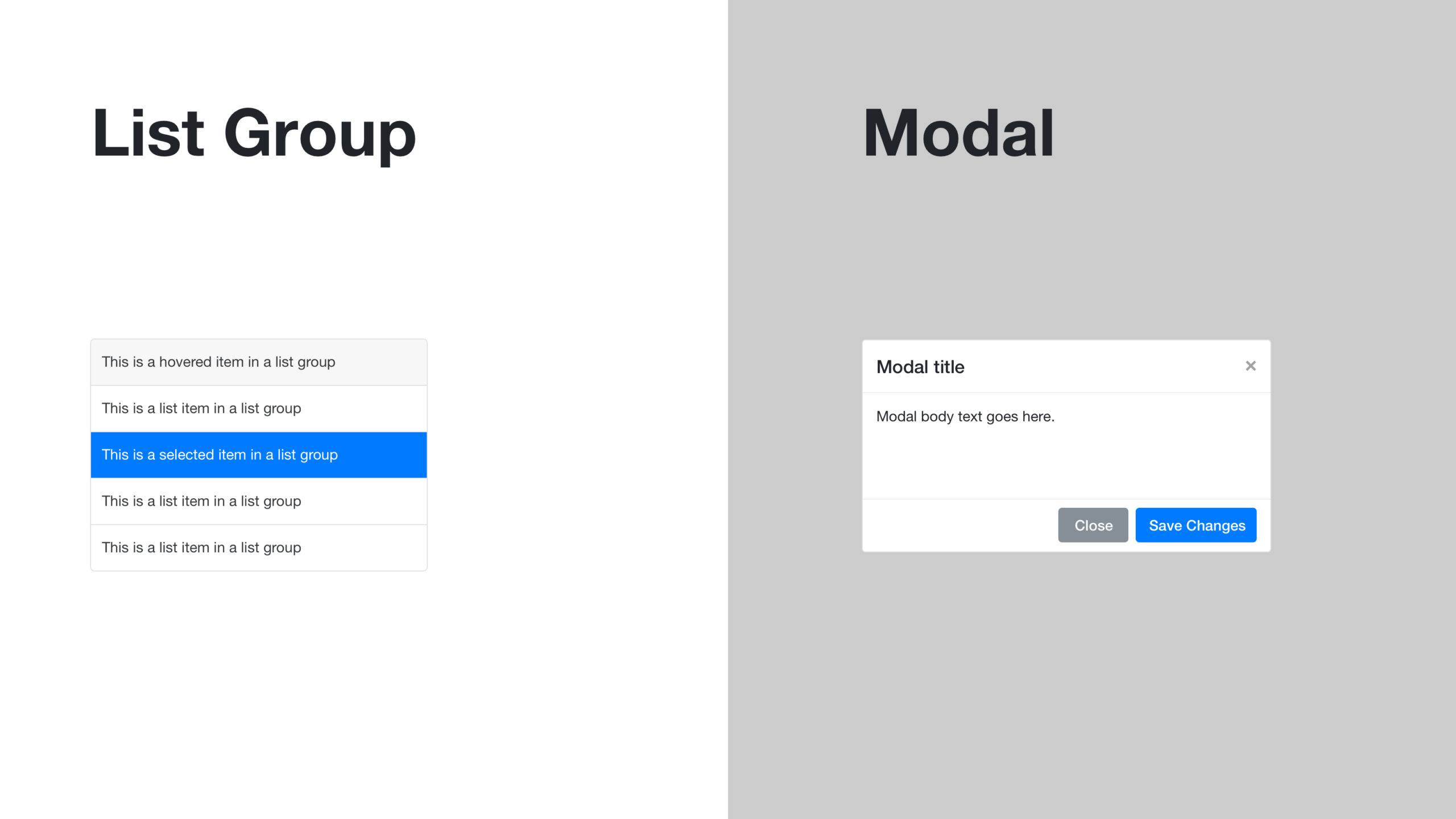
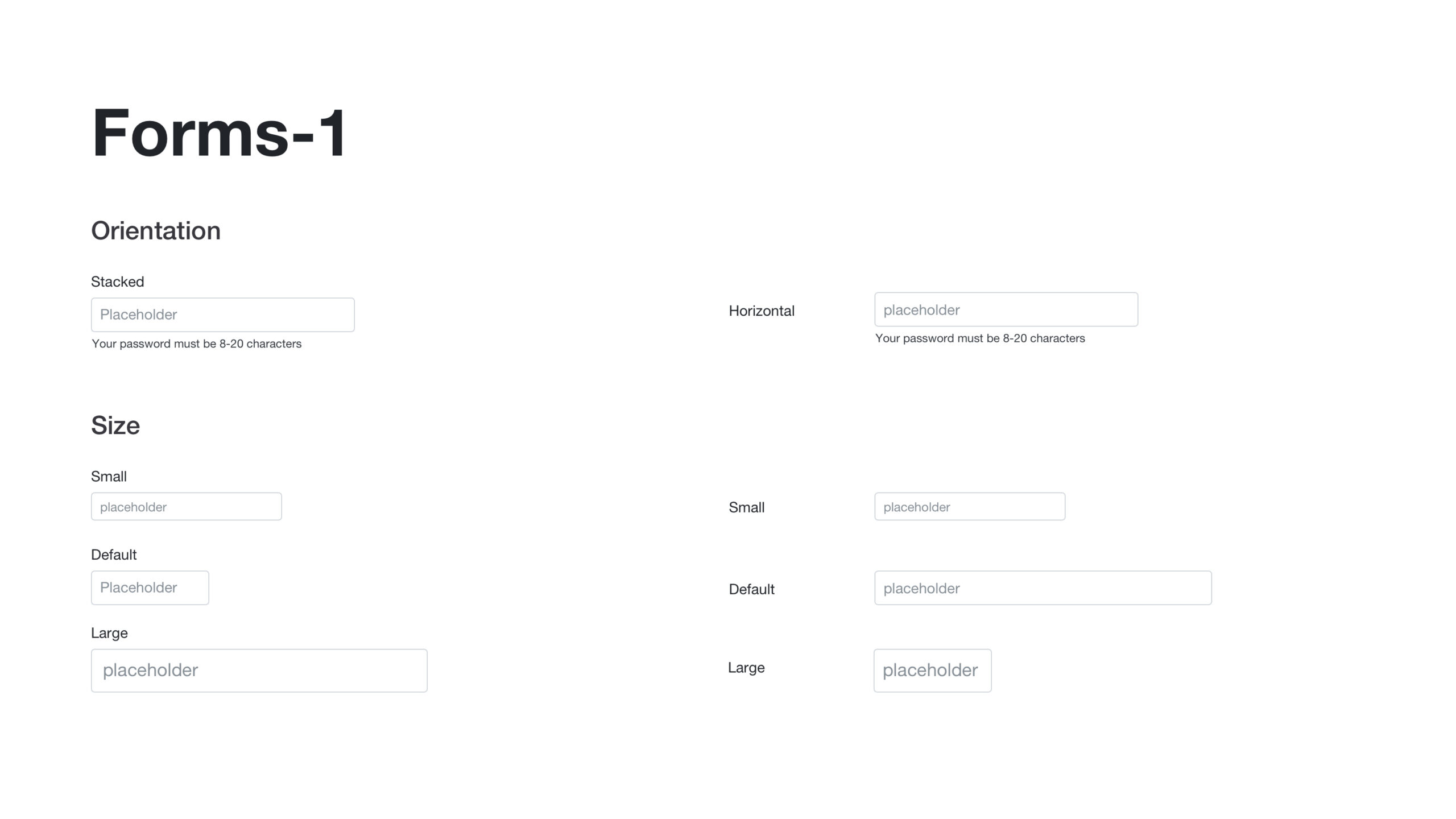
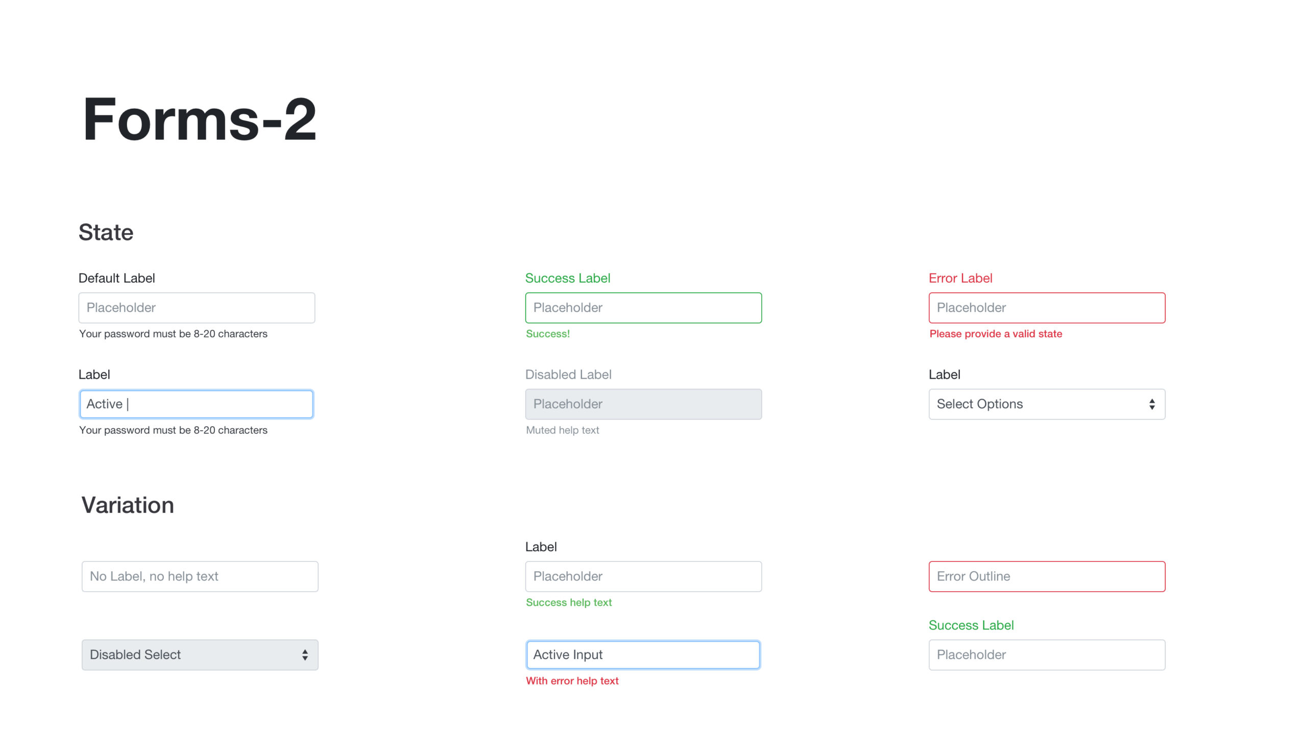
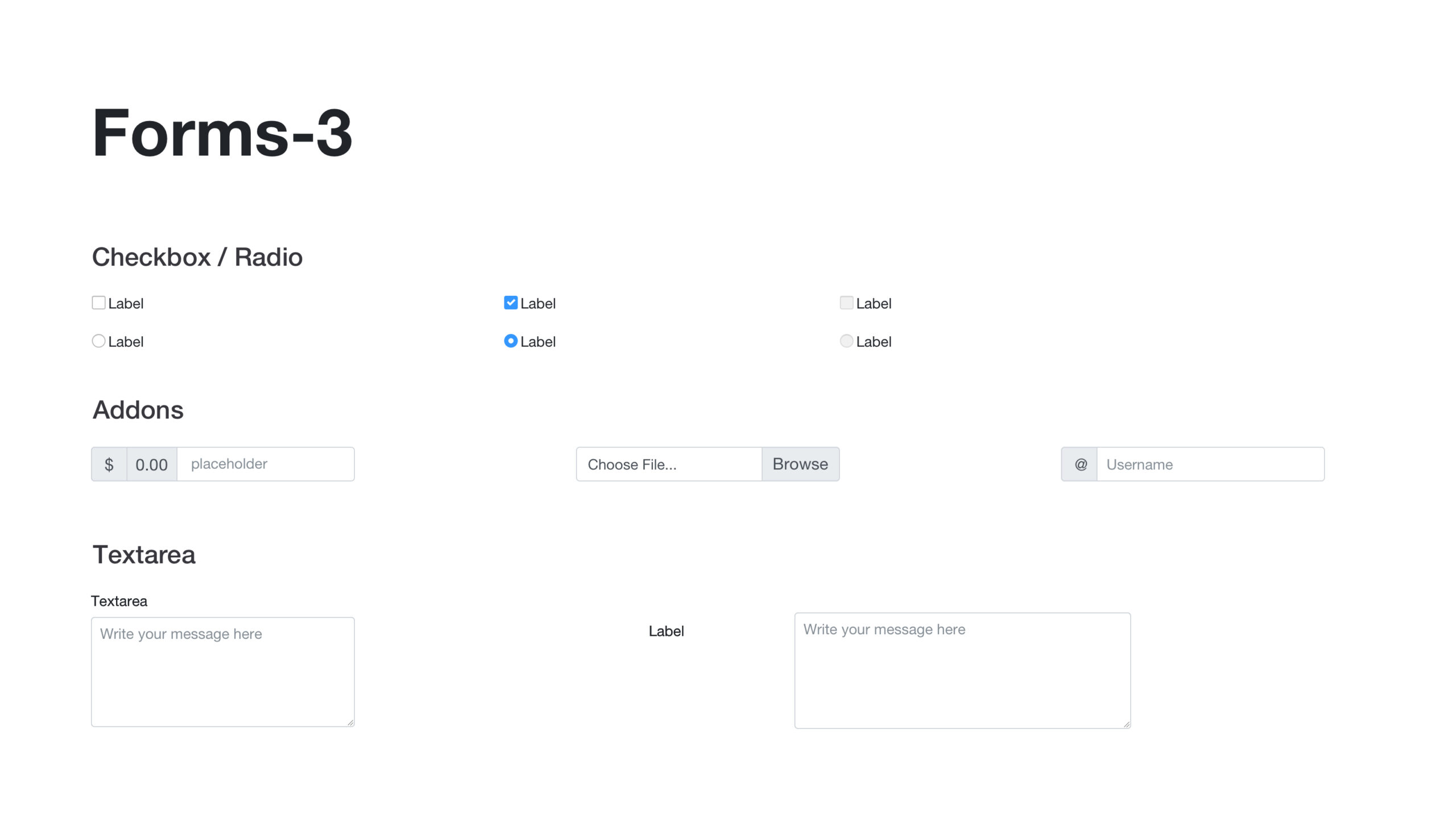
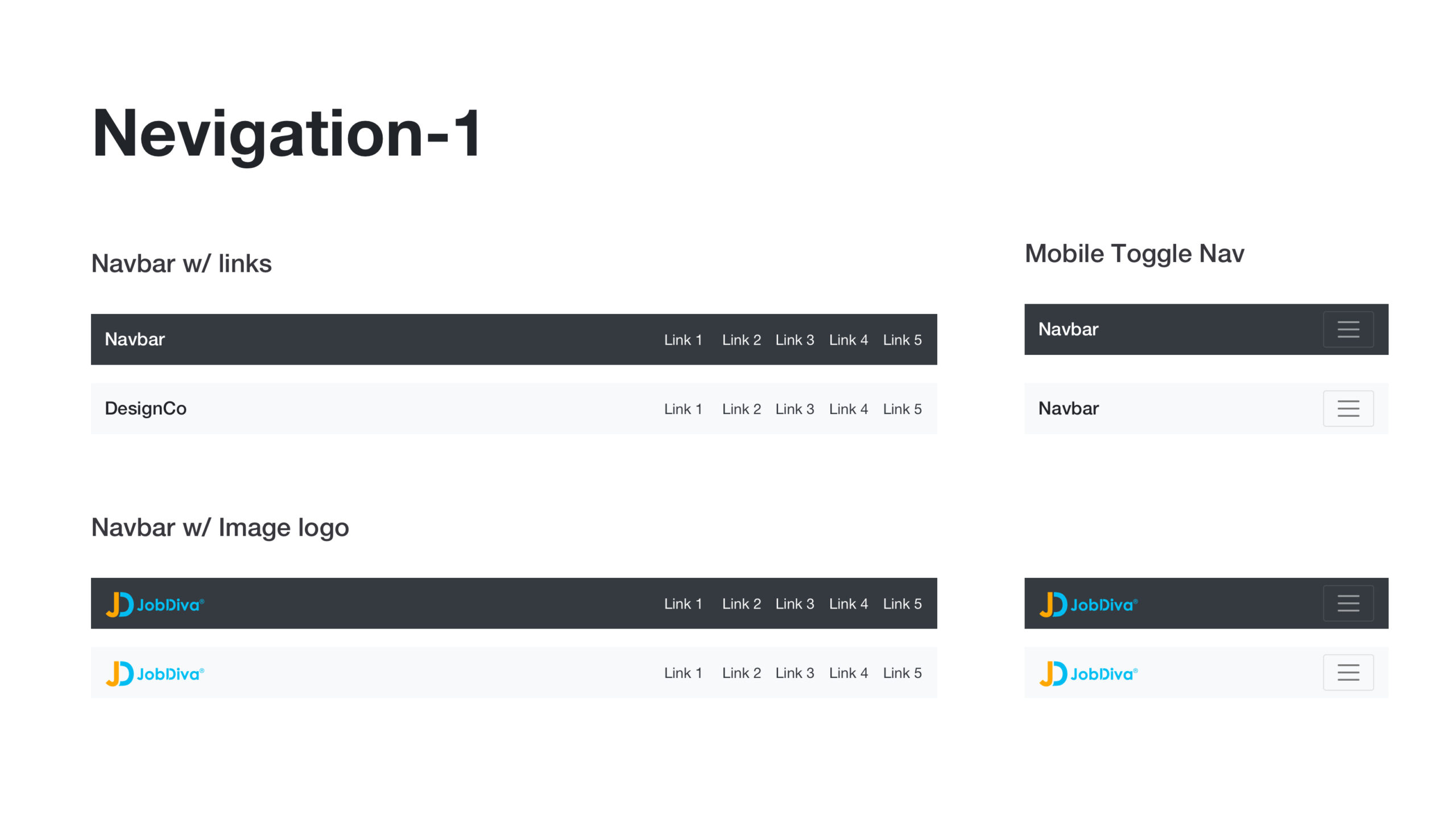
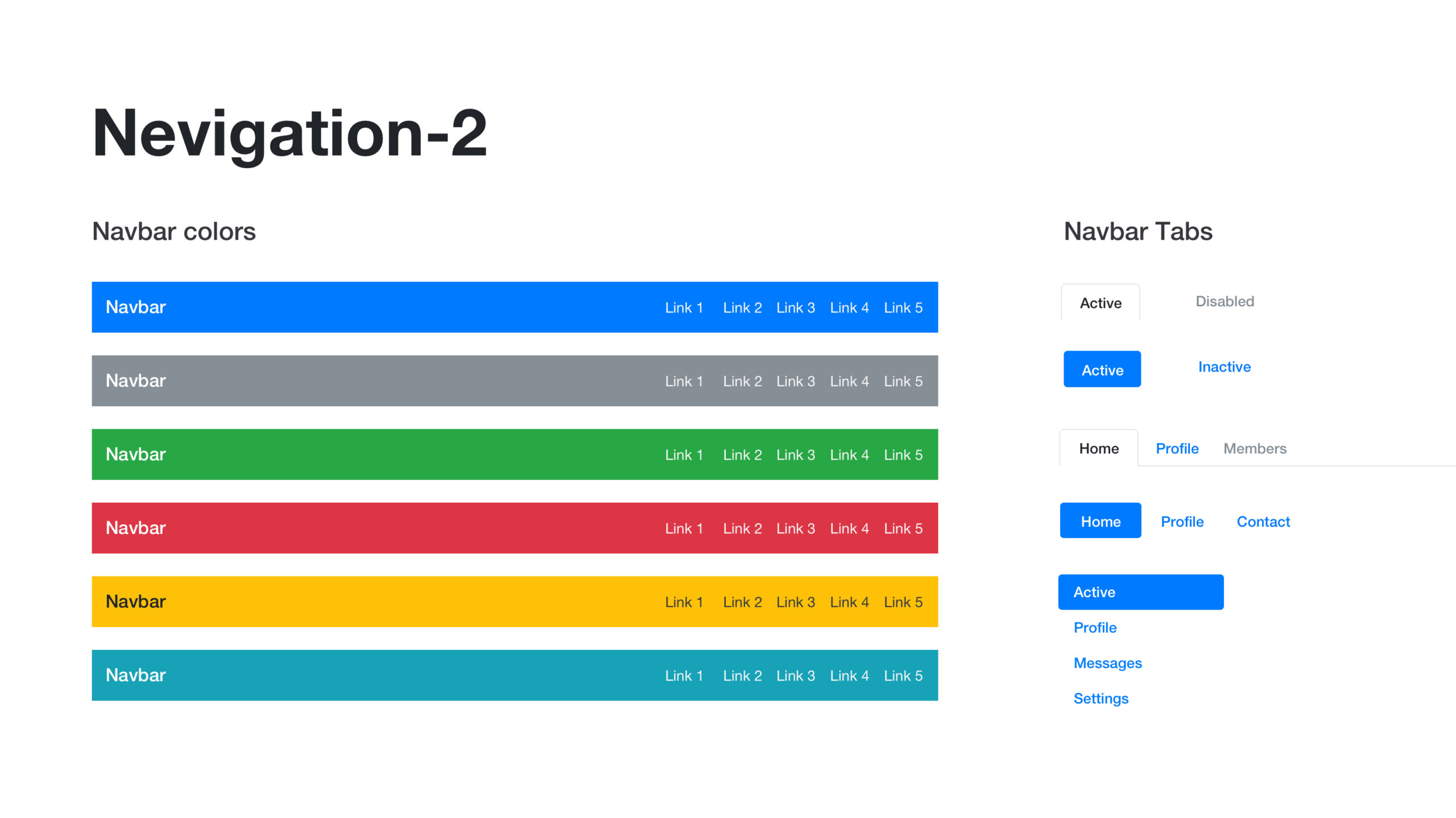
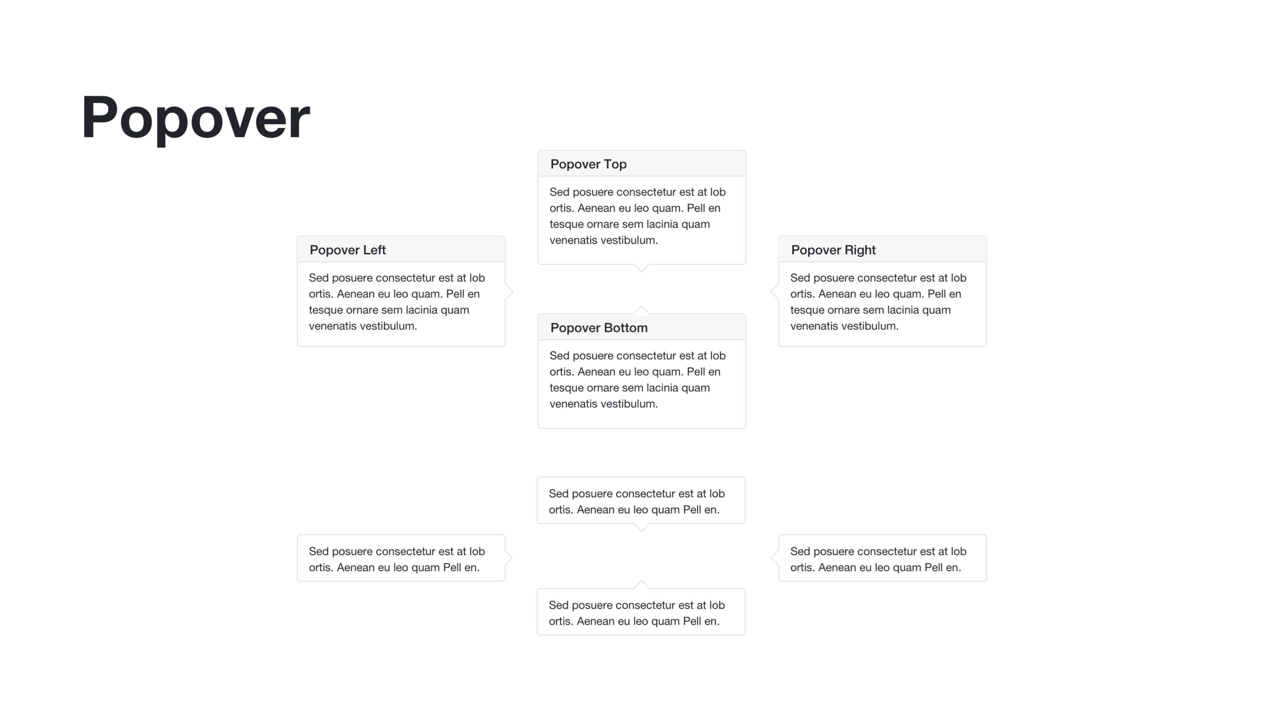
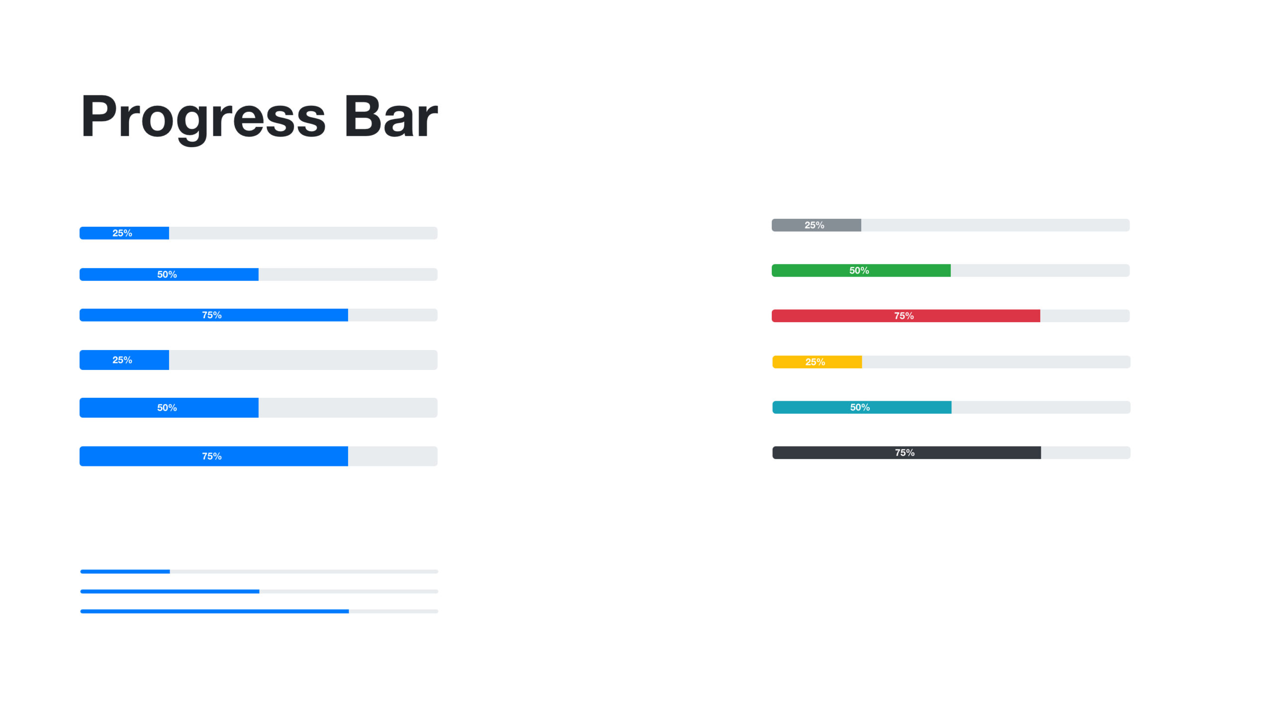
UI Challenge 1 - New Design System
Customizable for Different Clients
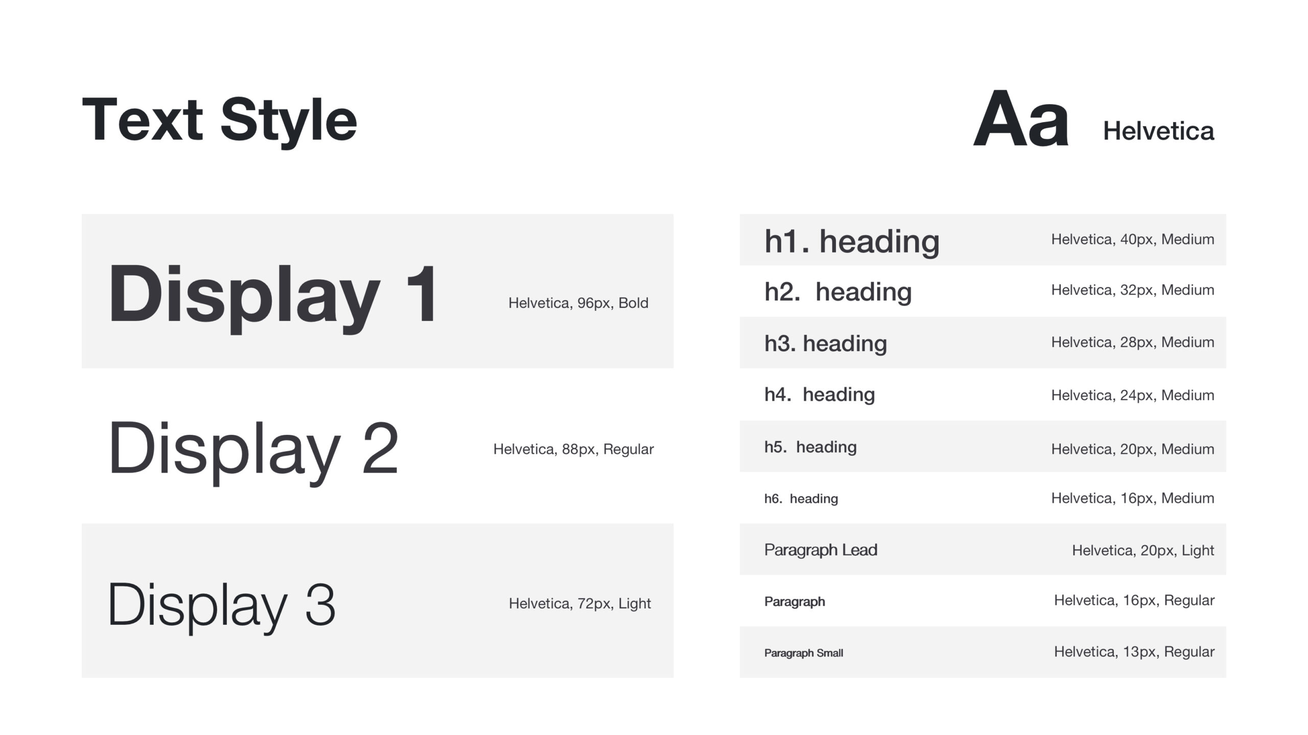
The new candidate portal/job board portal will be available for all of our current clients. In order to make sure the visual style is going to accommodate their branding color and visual guidelines, we need to make sure the new design system will be super flexible.
I picked 8 different colors and created 8 different themes. The following is the new design system with different themes.
UI Challenge 2
Increase Efficiency with UI Design
I went ahead applying the new design system into the UI design. And here comes another challenge: how can we make the process of fill out application forms more efficient? I went ahead run a few A/B testing with several UI various. And the following are some highlights about boosting efficiency with UI design by tweaking elements like positions, font size, colors, etc.
Before:
1. Having the most important information: Job #, Location, Job Type and Post Date on the top section
2. Move Apply Now CTA on the top right corner
3. Having another Apply Now CTA on the bottom of the page so users do not need to scroll back to the top to apply for jobs.
After:
4. Having all job-related information on the left panel with the most important information: Job #, Location, Job Type and Post Date on the top section
5. Having the Apply Now button in the right section. The button will always be there when users scroll up/down the page.
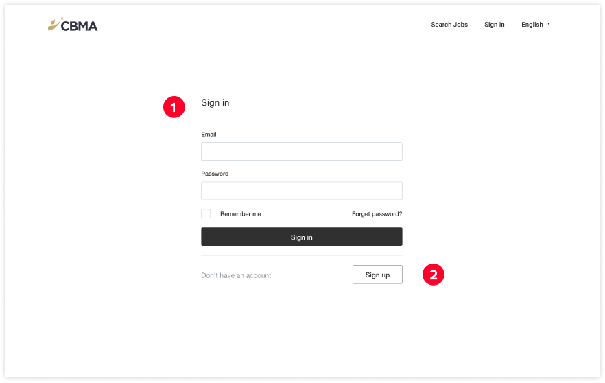
Before:
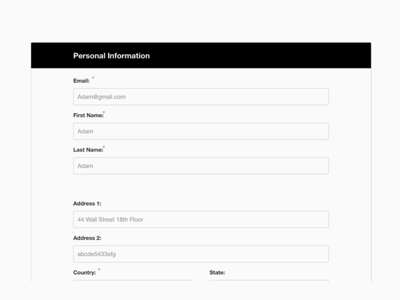
1. Making the entire sign-in module big and clear and align in the center of the page.
2. Having an addition Sign Up CTA on the button of the module so new users do not need to go back to click sign up button
After:
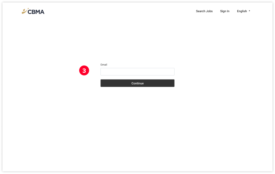
3. Ask users input email first. If the email is not in the database, it will ask users to create an account and input a password after finishing the entire job application process. If the email is in the database, then the password section will show up to ask return users to sign in
Before:
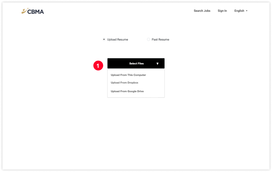
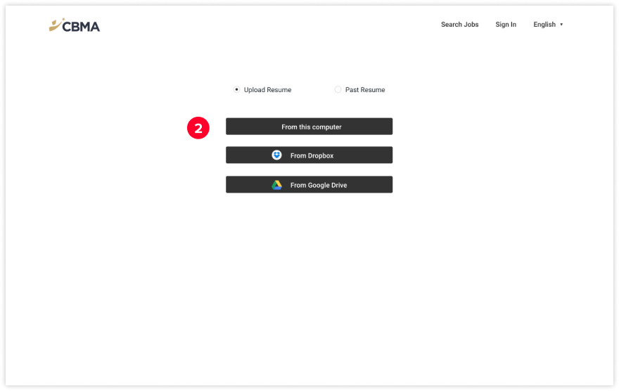
1. Having 3 different upload options folded in a dropdown module. Users need to click 2 times to upload their resumes.
After:
2. Listing out all 3 different upload options as CTA on the page, so users do not need to have an additional click.
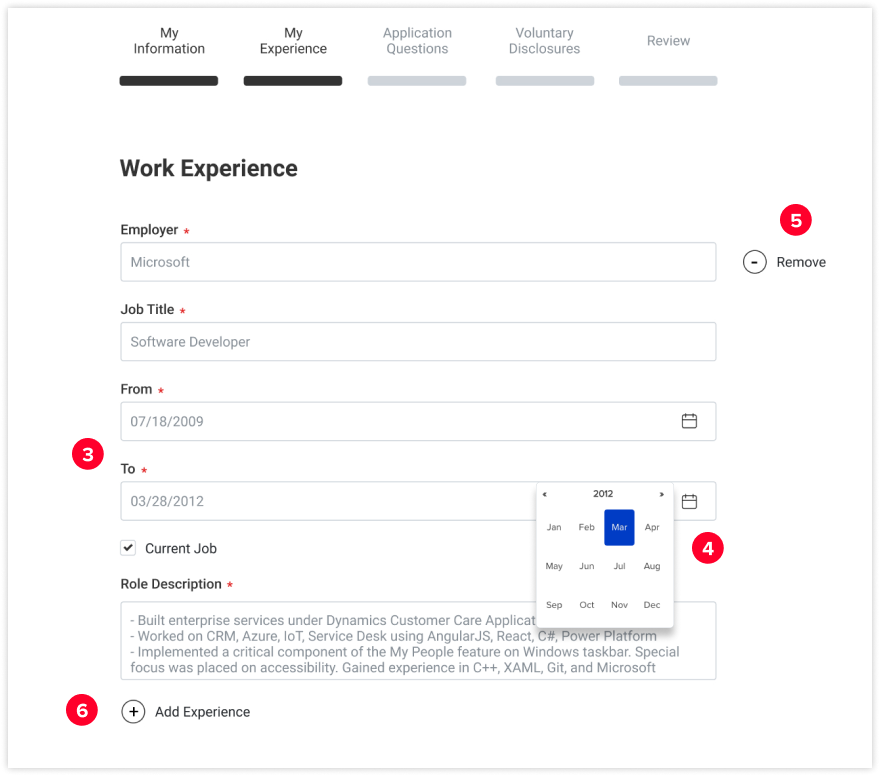
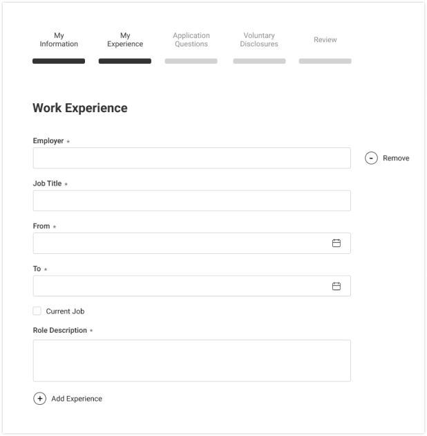
Before:
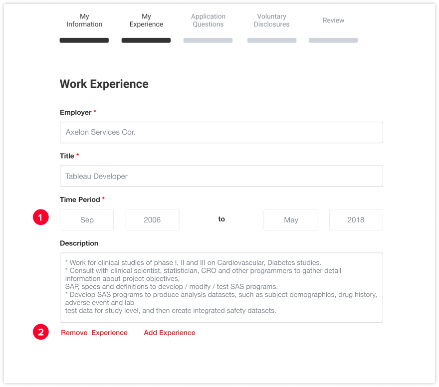
1. Having the start date and end date on the same line and require users to manually type the date
2. Having Remove Experience and Add Experience CTA in red color and put them under the module
After:
3. Put the Start Date and End Date on two different lines
4. Add an open calendar function to allow users to select the date from the pop up modal.
5. Having remove the experience icon on the top right corner of the module to keep the most important interactions on the right side.
6. Having Add Experience icon under the module to make the user flow more consistent (always from top to the bottom)
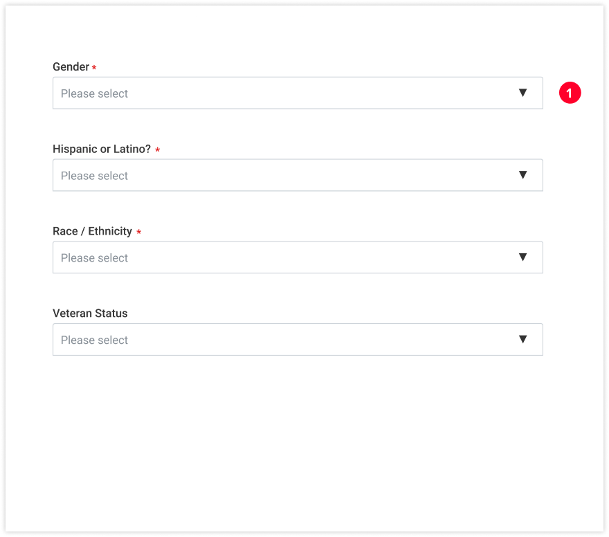
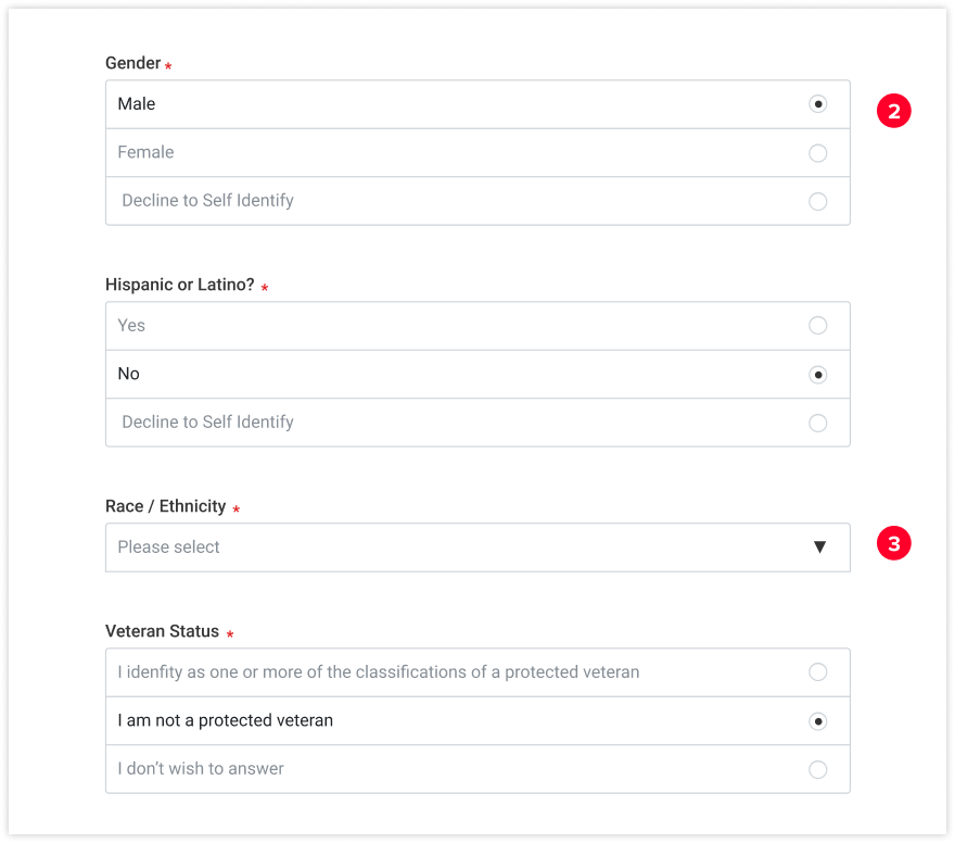
Before:
1. For all EEO questions, fold all answer options in a dropdown module. Users need to click the dropdown icon to choose their accurate answer.
After:
2. List out all available questions answers when there are less than 5 options
3. Fold options in a drop-down module when there are more than 5 available options.
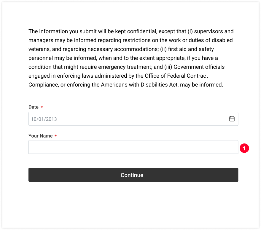
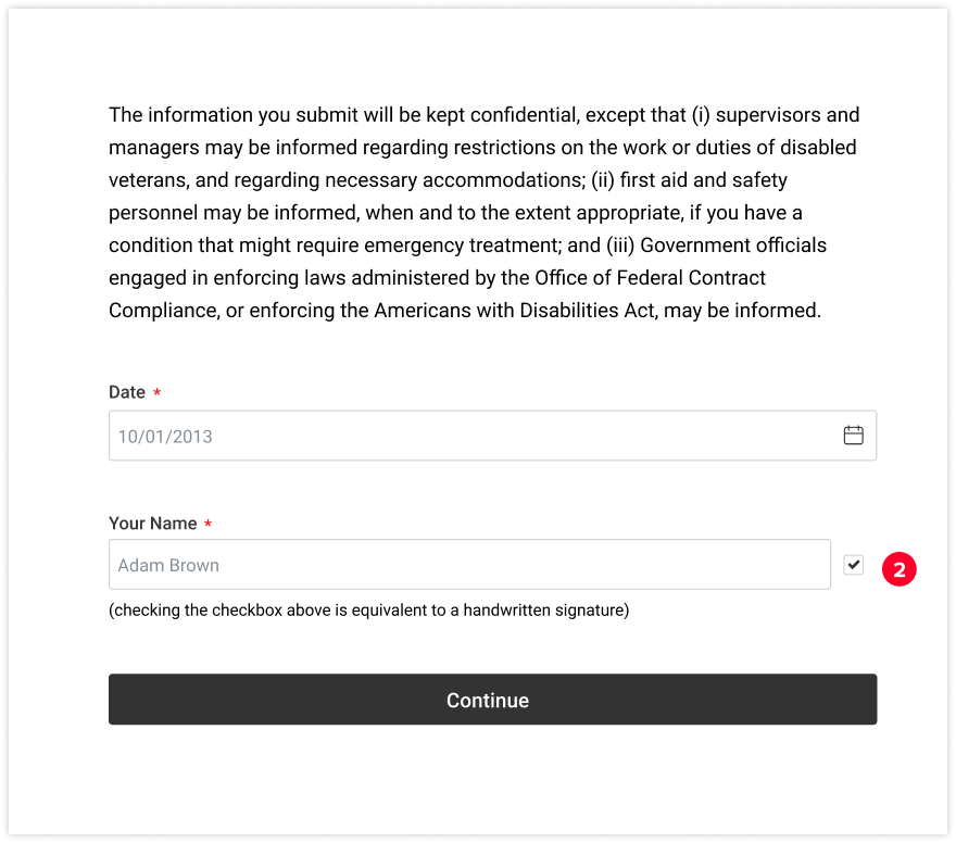
Before:
1. Users need to manually type their full name as "signature" to confirm all the information they provide is accurate to submit their job application.
After:
2. Users just need to click the checkbox with a pre-filled name to execute the action of “signature” to submit their job application
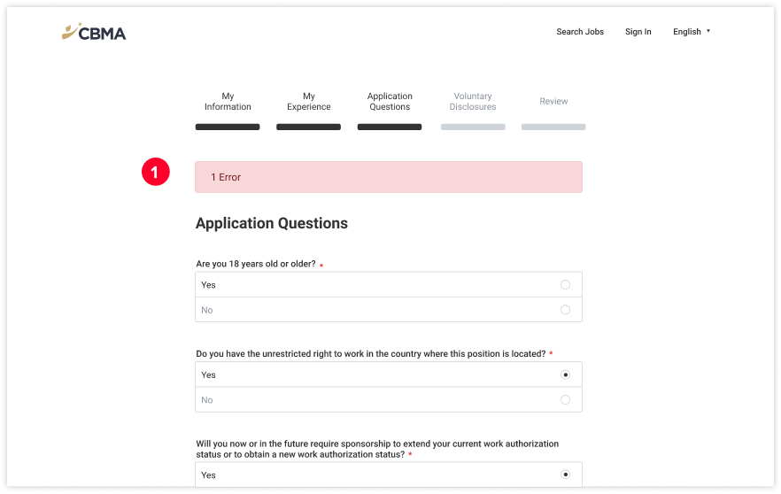
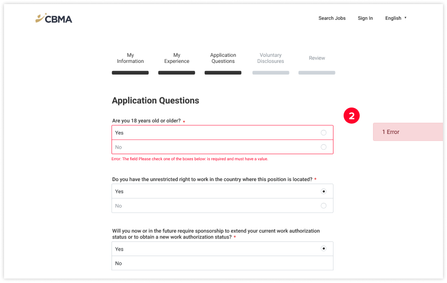
Before:
1. Showing the alert at the top of the application when errors detected by the system
After:
2. Move the alert banner to the right of the portal and change the outline of the form box to red with Error indication below it.
Key Result
13% decrease in drop out rate
24s saved on average time spend in filling out a job application
Reflections
Convincing a company that has lots of legacy products to adopt a new design system is pretty hard, especially the technology used is old. Companies cannot simply build a Design System on top of the current interface — they need a plan that involves development and design. Going for the big and daunting tasks can prove itself a mistake later.
The code needs refactoring and updates. The design needs consistency. To foster this evolution, developers and designers can save time by aligning themselves during the adoption phase. Developing new technology and a Design System should be in sync.
© Harri Lin 2023